Posts

Art Exhibit #2

I went to the art exhibit in the Loyola art gallery on December 7th, 2017. As I walked in, I was surprised to see the familiar faces of my fellow classmates hanging on the wall, with paint splattered all over them. This attraction immediately drew me in to gain a closer look at the photos. The students in the photos seemed to be staring at me; I knew every one of them. It was a mash up of photos of 12 different students, each with a black background. There were colors and powder-like substances on their faces and bodies. Some of them looking at the camera, and some looking away from the camera. I felt a bit uncomfortable, just because some of these students were in my classes, and some of them I knew rather well. I did not know exactly how to feel, but I knew that my fellow classmates were on the wall in an art gallery. It was an interesting sight to see. I assumed the deeper meaning of this particular piece of art to be how society will try to label humans with a scale called "

11/9/17 video homework

The video was pretty cool in terms of the way that data was shown through forms of image and art. I was confused because I feel like the older guy just kept saying "know your content" over and over again and nothing was explained in a way I could understand. This was also the same with the guy who talked about relating data and culture. I left the video not understanding what they meant at all by those things. I also extremely disliked the comment from the guy who said objective truth changes over time. the definition of truth is something that doesn't change and is constant, and "true." If it is still changing, then the truth has not yet been discovered. Overall, I had some problems with some of the comments of some of the narrators, but enjoyed (and always have) the artsy representation of data.

Postmodern Visual Analysis

The quote I chose for my postmodern piece was, " There is nothing funny about Halloween. This sarcastic festival reflects, rather, an infernal demand for revenge by children on the adult world." The piece that I did to reflect this quote has a picture of four children with a gloomy, dark background. This picture also includes low opacity picture of Pennywise the clown from the book and movie IT, and a bright red balloon, also from the movie IT. This picture is 8.5 by 11 and is centered directly in the middle of the Bristol pad page. On the outside of the picture there is a bat on the right side and bat on the left side. From the bottom of these bats streaks blue and orange paint. There are green figures (sort of shaped like fireworks) above and below the picture centered in the middle. There is a black frame around the picture. Finally, uniformly throughout the art there are streaked ink blotches and dots.  The connotative level of this makes me feel tension. Sinc

White Color Project

Image
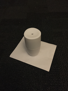
 This is the first picture. The paper on the bottom in this picture is a little bit "whiter" than the diffuser that is on top. However, in the shadowed areas the paper is a darker white than the diffuser. This is with the lighting changed. I shined a light directly on it. The bottom of the diffuser in this light became a bit more rose gold colored, while the top of the diffuser became a bit more grey. The paper on the bottom becomes more red than just a usual white while under the diffuser in this lighting.

Ad Project

Image
The altered ad                                                                       The original ad

Art Gallery Post #1

Image
I attended the Art Gallery: In Light of the Body . This gallery's main focus was around human skin. All of the pieces were either a picture of people, or a close up painting of skin such as the one above. The piece above was my favorite in the gallery shown. The reason it was my favorite is because it depicted a greenish tint in it, and that greenish tint is what I believe to be the veins underneath the skin. While there were many other pieces in the gallery with many colors of skin depicted - light, dark, and different colors in between - this one depicted the veins. I appreciated the veins so much because it sees beneath the skin tone and presents something that we all have in common: blood. So much of modern day's conversation and discrepancies are found talking about things such as skin tone, but this brings us deeper to a commonality between all people, regardless of skin tone. If we are able to look deeper at what we have in common as humans, which is our life, and whe

Blog Post 4: BMA

Image
 Interest level 1-3 The Painter's Window  (3) The Painter's Window  was the least interesting of the three paintings I picked. The composition includes a focal point around the paint brush, and a golden triangle. It somewhat follows the vertical rule of thirds; with the middle third including most of the complexities of the painting. There are many radiating lines that lead back to the focal point of the painting. There are also leading lines which help lead the eyes through the composition. In fact, most of the lines in this composition are straight. There is also an L-shape, and also a golden ratio in this painting. This painting has many compositional features. This painting was painted in 1925 by Juan Gris. This cubism work displays an array of different mediums such as music, games, food, and art. My perception of this painting was the combination of different things that mattered most around this culture into one piece of art. These were brought together through c